
Optimize Your Online Menu for the Best-Looking PDF (Images, Layout, Typography)
A print-ready PDF menu starts with digital-first decisions. Preparing images, layout, and typography in your online menu saves time, avoids reprints, and ensures the PDF your printer or guest sees looks professional. This guide gives practical rules you can apply in EasyMenus before you export.
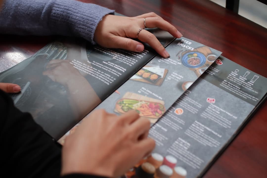
Pro tip: Always zoom to 100% in the PDF preview to check image sharpness before ordering prints.
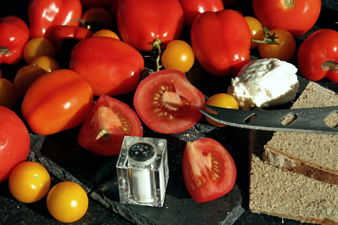
Why it matters: Low-resolution images or incorrect crops show pixelation or awkward trims on printed menus. Aim for clarity without bloating file size; good images improve perceived quality and reduce reprint costs.
Recommended resolution: For photos used on an A4/A5 menu, supply images at 300 PPI at the final print size. For example, a 3.5 x 2.0 inch food shot should be ~1050 x 600 px. For full-bleed images (edge-to-edge), prepare files at 300 PPI plus bleed (see below).
File format and compression: Use high-quality JPEGs (sRGB) for photos and PNG for graphics with flat colors or transparency. Keep individual image files below ~2–4 MB when possible to keep exports fast while maintaining quality.
Set a 0.125 in (3 mm) bleed around any element that runs to the page edge. Keep important text or logos at least 0.125–0.25 in (3–6 mm) inside the trim line (safe area). When you crop in EasyMenus, preview the bleed option in the PDF wizard and nudge the crop box so faces and important text aren’t cut off.
1) Resize to 300 PPI at final print dimensions. 2) Crop for composition and leave breathing space. 3) Add 3 mm bleed for edge-to-edge art. 4) Convert to sRGB color profile. 5) Save as high-quality JPEG or PNG and name files clearly (e.g., "salmon_plate_3x2.jpg").
Why it matters: A well-ordered menu reduces decision time for diners and prevents awkward orphan lines or cramped sections on the exported PDF.
Section ordering: Start with your high-margin or signature items (starters or chef’s picks) then move to mains, sides, desserts, and beverages. For multi-page PDFs, repeat section headers or add page footers so staff and guests aren’t confused when a section breaks across pages.
Line lengths and columns: Aim for 45–65 characters per line for readability in body text. For menus, two-column layouts often work well for A4/A5 sizes; keep item names and descriptions aligned to avoid ragged edges. If an item name runs long, use a soft hyphen or two-line layout so prices remain aligned.
Preview each page for widowed or orphaned lines, check that prices align to the same decimal column, and ensure icons (e.g., vegetarian, spicy) are consistent in size. In EasyMenus, use the live preview and toggle mobile/print views to catch layout breaks.
Why it matters: Some fonts look great on screen but print poorly or aren’t embedded in PDFs, leading to substitution and layout shifts. Use fonts that scale, stay legible at small sizes, and embed cleanly in PDF exports.
Best practices for font choices: Choose a clear serif or sans-serif for body copy (e.g., a modern humanist sans for readability). Use display or script fonts sparingly for headings only. Keep body sizes between 10–12 pt for print menus and 14–16 px for any digital-only views.
Embedding and fallback: If you use custom or Google fonts in your EasyMenus theme, confirm the PDF export embeds those fonts. If embedding isn’t available for a font, switch to a widely supported alternative (e.g., Helvetica, Arial, Times New Roman) to avoid substitution.
1) Body font: legible at 10–12 pt. 2) Heading font: distinct but not decorative. 3) Price column: monospaced or tab-aligned for consistent alignment. 4) Line height: 1.1–1.4x for compact menus. 5) Accessibility: ensure contrast ratio is high for poor-light conditions.
For a comprehensive overview, see our guide: Print-Ready PDF Menus & Templates (Online → PDF Builder)
Related: How to Build a Print-Ready PDF Menu from Your EasyMenus Account
Why it matters: Catching issues beforehand avoids costly reprints and last-minute design work. EasyMenus’ PDF builder offers live previews and a final proof step—use them.
Step-by-step: Start in the PDF Builder wizard, choose template size (A4/A5), and enable bleed if needed. Use the live preview to flip through pages, zoom to 100% to check image sharpness, and toggle languages if you publish a multilingual PDF. Adjust section order or padding in the builder; changes go live in seconds for instant re-preview.
Proofing with real-world checks: Print a one-page test on your in-house printer at actual size. Inspect photos for pixelation, check that descriptive copy lines don’t break awkwardly, and confirm prices align. If you use a commercial printer, request a physical proof for color-critical jobs.
1) Verify image resolution at 100% zoom. 2) Confirm bleed and safe area settings. 3) Check font embedding or switch to a supported font. 4) Review section headers and page breaks. 5) Test-print a proof page. 6) If multilingual, review each language version. 7) Use EasyMenus’ export to generate the PDF and re-open to confirm.
Warning: If fonts aren’t embedded, the PDF may substitute them on other systems—confirm embedding before final export.
Common pitfalls and how to avoid them: Fonts substituted on export, low-res images, and missing bleeds are the top reasons for reprints. If you spot a substituted font, replace it and re-export. If images look soft, revisit your source files and replace them with 300 PPI exports.
Color and contrast: Remember that screens use RGB while printers use CMYK. For brand-critical colors, request a printer proof or convert images to CMYK before export if your printer requires it. Keep contrast high for legibility—thin light text on textured backgrounds often disappears in print.
Save time with templates and automation: Create a trusted template in EasyMenus with preset typography, margins, and image placeholders. For daily specials or seasonal changes, use the Live Editor and export only the updated pages to reduce full-menu reprints.
If you change item prices or descriptions frequently, prefer digital updates and re-export PDFs for receipts or takeout menus. Reserve reprints for major seasonal redesigns, permanent price changes, or branding updates to control costs.
Related: Choosing the Right Menu Template: Sizes, Paper, and Accessibility
A professional PDF menu is the result of small, repeatable checks: high-res images, clean layout, export-safe typography, and a final proof. Use EasyMenus’ live preview and PDF Builder to iterate quickly—fixing these issues digitally prevents expensive reprints and keeps your brand looking sharp. Start with one test print, lock a template, and you’ll save time and money every season.