

How to Spot High-View, Low-Order Dishes on a Digital Menu
Some menu items get plenty of attention but still fail to turn into orders. When that happens, the problem usually is not visibility alone. It is a conversion issue inside your digital menu. If you can identify high-view, low-order dishes early, you can fix underperforming menu items before they drag down sales, clutter the guest journey, or weaken average order value. This guide shows you how to use restaurant menu analytics to diagnose what is going wrong and decide whether to rewrite, reprice, reposition, simplify, or remove a dish.
Do not assume a highly viewed item needs more promotion. If guests already see it but do not order it, the problem is usually conversion, not visibility.
A dish with low views and low orders may simply be buried. A dish with high views and low orders is different. Guests are seeing it, considering it, and then choosing something else. That makes it one of the clearest signals in digital menu performance.
In practical terms, these items can slow decision-making during busy periods, create menu clutter, and take attention away from dishes that could convert better. If your burger gets 400 views and 18 orders while another gets 220 views and 40 orders, the first item is not just underperforming. It may be creating friction.
This is where menu item conversion restaurant teams often overlook the real issue. They assume the dish needs more promotion, when it may actually need better positioning, a simpler modifier flow, stronger value communication, or a more appealing presentation. Your goal is not to make every dish a bestseller. It is to make sure the dishes guests notice have a clear path to order.
Before you rewrite half the menu, make sure you are reading the signal correctly. A high-view, low-order dish should be evaluated in context, not in isolation. Restaurant menu analytics work best when you compare similar items, similar traffic windows, and similar service modes.
For example, a premium steak may naturally convert at a lower rate than fries, and a delivery-only item may behave differently from a dine-in favorite. You want to find dishes that are noticeably weak for their category, price band, and placement on the digital menu.
It also helps to separate short-term noise from repeat patterns. If a dish underperforms for one Saturday, that may be random. If it underperforms across two or three review periods, especially with strong visibility, that is a candidate for action.
Review each item using five checkpoints: 1) total item views, 2) orders or add-to-cart actions, 3) conversion rate compared with category averages, 4) performance by service mode such as dine-in, pickup, or delivery, and 5) whether the pattern repeats over time. Flag dishes that are above-average in views but below-average in conversion. Those are the items worth diagnosing first.
For a comprehensive overview, see our guide: Restaurant Menu Analytics & Upsells: Use Digital Menu Data to Improve Conversion and Average Order Value
Related: A Weekly Menu Analytics Review for Owners and Managers
Once you know which items are getting noticed but skipped, the next step is diagnosis. In most restaurants, the cause comes back to one of five areas: pricing, descriptions, photos, placement, or modifier friction. Each one affects how confident a guest feels about ordering.
The important thing is to avoid vague conclusions like "people just do not want it." Guests usually leave clues in their behavior. If a dish gets opened often but never ordered, the issue may be the item page itself. If it performs better in one category placement than another, visibility context may be the problem. If it drops off during delivery but not dine-in, the culprit may be travel suitability, packaging expectations, or add-on complexity.
Guests do not judge price alone. They judge whether the item feels worth the price compared with nearby options. A chicken bowl at $16 may convert poorly if a fuller-looking pasta sits right above it at $15.50. Check whether the item is priced awkwardly inside its category, whether portions are clearly communicated, and whether premium ingredients or sides are explained well enough to justify the price.
A dish name can attract views, but the description closes the sale. If the copy is vague, guests may hesitate. Replace generic wording like "chef special" with specifics about flavor, protein, portion, heat level, or what is included. Photos matter too. A blurry, dark, or inconsistent image can lower confidence even when the dish itself is good.
Some items get many views because they are near the top of a category, marked as featured, or placed in a high-traffic section. That does not guarantee orders. If an item gets attention but loses to the dishes around it, compare the surrounding context. Sometimes the item is simply in the wrong neighborhood and looks weaker next to better anchors.
Even strong dishes can lose orders if the path to checkout feels annoying. Too many required modifiers, unclear size choices, confusing combo options, or extra clicks during rush periods can all reduce conversion. If guests like the item but the ordering flow feels heavy, they often abandon it and choose a simpler alternative.
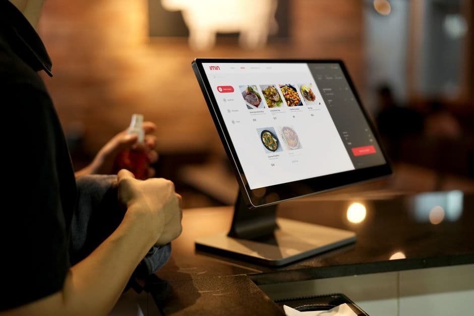
Data tells you where to look. A manual audit tells you what the guest is feeling. Open the underperforming dish on mobile, the same way most guests do, and go through the full ordering process yourself. You are looking for hesitation points that analytics alone may not explain.
Ask simple questions. Is the item name instantly clear? Does the photo match the quality of your other listings? Does the description answer what it is, what comes with it, and why someone would choose it? Are there too many mandatory modifier steps before the item can be added to cart? Does the final price feel higher than expected once extras are selected?
For operators using a digital menu with real-time updates, this is where fast experimentation becomes valuable. You can test a shorter description, move the item within a category, simplify modifier logic, or change the featured image without waiting for a full menu reprint. With EasyMenus, those edits can go live in seconds, which makes it much easier to fix underperforming menu items while the insight is still fresh.
Start with one flagged dish only. First, compare its conversion rate to three similar items. Second, review its price and what is included. Third, rewrite the description so the value is obvious in one quick read. Fourth, check whether the photo helps or hurts confidence. Fifth, complete the modifier flow on mobile and count the taps required before checkout. Sixth, decide on one change to test first instead of changing everything at once.
Quick win: simplify required modifiers on one low-converting dish and monitor whether add-to-cart rate improves in the next review cycle.
After diagnosis, make a specific decision for each item. Not every high-view, low-order dish deserves a rescue plan. Some need a simple copy update. Some need a better category position. Some should be repackaged with add-ons or sides. And some should leave the menu entirely.
Rewrite the item when the problem is clarity. This is common for dishes with unclear names, weak descriptions, or missing context around portion size or ingredients. Move the item when it gets attention in the wrong place but competes poorly against stronger neighbors. Bundle it when the standalone value feels weak but the dish fits naturally into a meal deal or pairing. Remove it when repeated testing shows the item attracts interest but still fails to earn orders.
Keep your tests narrow. Change one main variable at a time, then watch the next review cycle. If you lower price, do not also rewrite the photo and move the category placement on the same day. Otherwise, you will not know what improved conversion.
This disciplined approach is what turns restaurant menu analytics into action. Instead of guessing, you build a repeatable process for digital menu performance: find the friction, test the fix, measure the lift, and keep improving the guest journey.
Use this rule of thumb: if the item is appealing but confusing, rewrite it. If it is solid but misplaced, move it. If it needs a stronger value story, bundle it. If it repeatedly fails despite visibility and testing, remove it. Menu space matters, and every item should earn its place.
Related: How to Reorder Categories and Featured Items Based on Menu Performance
High-view, low-order dishes are one of the most useful signals in a digital menu because they show you where guest interest breaks down. When you review pricing, descriptions, photos, placement, and modifier friction together, you can see whether the item needs better communication, a smoother order path, or a smaller role on the menu. The win is not just fixing one dish. It is building a smarter operating habit. When you regularly review menu item conversion, test focused changes, and update your digital menu in real time, you create a menu that is easier to order from and better at turning attention into revenue.